Sticky headers and sticky menu navigation are contentious subjects. While some feel they divert attention from what should be the focus, others think they are an integral component of the architecture of contemporary websites. Both theories are true, as is the case in many instances of conversion funnel improvement.
- On sites that try to elicit more visitor action
Sticky navigation functions well on e-commerce, retail, and other “actionable” websites where the creator wants users to take a certain action, such as clicking to make a purchase. Sticky menus have been demonstrated to dramatically improve customer experience in these circumstances by preserving customers’ spatial awareness and granting them more control over their navigation on your website.
- Put it on long pages
Every organization can benefit from having user-friendly and straightforward navigation, particularly on pages with a lot of material that forces users to scroll. Visitors can navigate the page’s content easily and effectively with the use of clear on-page navigation. Sticky navigation is a speedier, simpler way to allow users to hop to a new page on your site and continue their experience, even though “return to top” links might aid in achieving a similar result.
- It’s great for sites with older audiences
So why do younger people and older adults respond to sticky navigation more favorably? It is due to older adults and much younger users’ generally lower levels of web confidence and the resulting need for additional help, which sticky navigation offers. Sticky navigation menus instill a sense of confidence in users of all ages, including older individuals.
WP Sticky
The freemium WordPress plugin WP Sticky is the best tool you could choose for the job. It’s been around for a little over two years and has over 100,000 active installations and plenty of five-star reviews. But since you will have to pay for the plugin, it’s a good idea to read a few reviews first to make sure you really want to get it.
Basically, this plugin claims to be extremely fast and compatible with other plugins. Additionally, it provides both beginners and experts with a good number of simple-to-use features. The visual picker appears to be one of its standout features. It completely eliminates coding from the equation, which makes it a great choice for those not overly experienced in web design.
Let’s see it in action
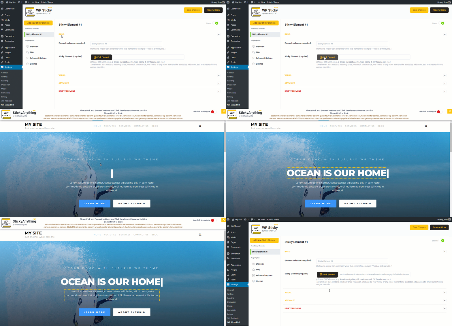
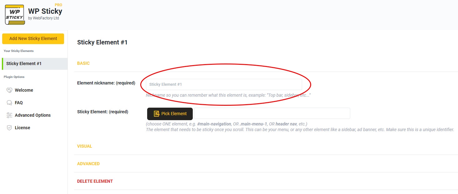
As promised, the user interface is straightforward but still offers a wide range of features. To create a new sticky element, simply select the plugin from the “Settings” menu, give it a name before the process begins, and you’re done.
After naming the element, you’ll be taken to the aforementioned visual picker. The existence of the visual picker makes everything simpler, as you won’t have to use a lick of code. So, those of you that were worried about the plugin being too technical – fear no more.

By selecting the “Pick Element” button, the visual picker is launched. The plugin will then start loading your website and add a WP Sticky menu at the top. As you move the cursor around, tiny yellow lines will appear around each individual piece, letting you know which one you should select. When you click on the element you want to make sticky after you’ve isolated it, the plugin will create a special identifier for you. If you need any help with this, you can always contact the plugin’s support team; the developer knows the importance of customer experience management and is always ready to help.
Customization
One of the default settings is also one of its best ones. Under the “Basic Options” this plugin allows you to choose the screen sizes that will display the sticky elements and in accordance those that will not. Do you like a wider sticky menu when browsing on a desktop but not when using a smartphone? With this clever plugin, it’s simple to get what you want with just one click; all you have to do is turn it on or off for the appropriate devices. Your sticky element can also have effects added to it, such as fading in or gliding down to make it more eye-catching. Decide which you prefer after trying both.

Additionally, you can add a background color to your sticky element to make it stand out and look beautiful on your website and adjust the element’s opacity using a slider to make it more or less transparent. It’s important to note that you don’t have to mess around with any of these features if you don’t want to, but you can if you choose to.
Pricing
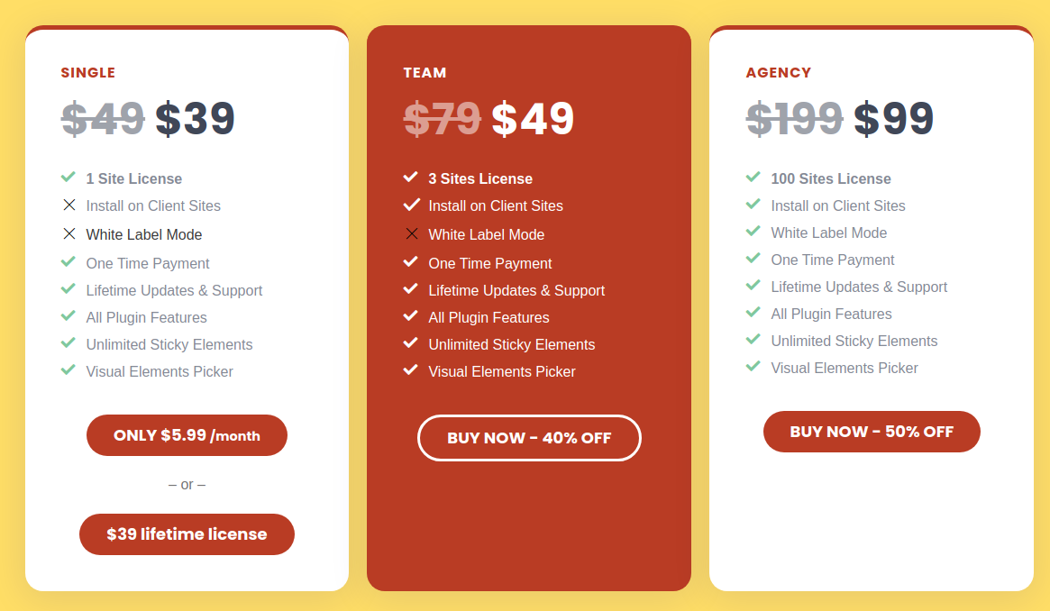
WP Sticky offers three different pricing options. And if you’re a site owner, it’s likely that you’ll only need the Single or the Team plan, both of which are now available for $39 and 49$, respectively.

However, do consider the Agency plan, which costs $ 99, if you have more than three websites or intend to use this plugin’s white-label mode to deal with customers.
Final Thoughts
WP Sticky is an all-in-one plugin any site owner in need of sticky navigation would be glad to have. And considering the benefits it brings your site, we’d dare say almost every site needs it.


